
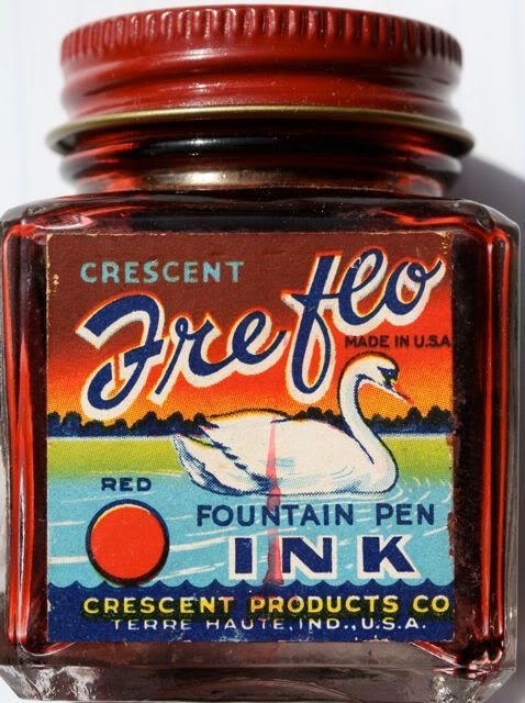
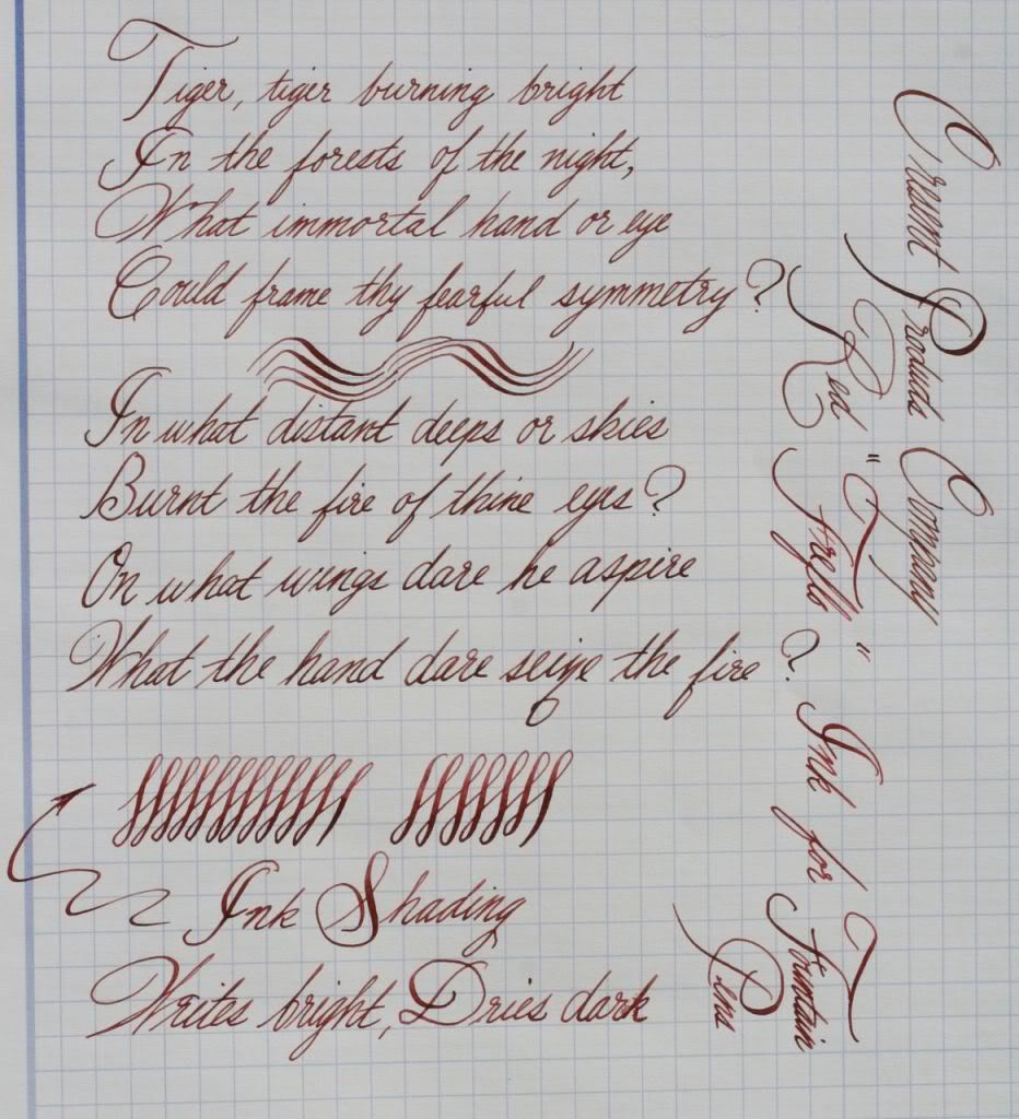
Freflo ink was manufactured by for Crescent Products Co., of Terre Haute, Indiana. This ink is water based. I spilled this ink on a white shirt, and was able to completely remove the stain by immediately washing it with liquid hand-soap and water, followed by an application of isopropyl alcohol. It’s obviously not a permanent ink. But with vintage pens, it’s the characteristic I prefer. Crescent Products was located at 315 N. 14th St., Terre Haute, Ind., and produced ink and adhesives until the early 1960s (according to Terre Haute city and industry directories).
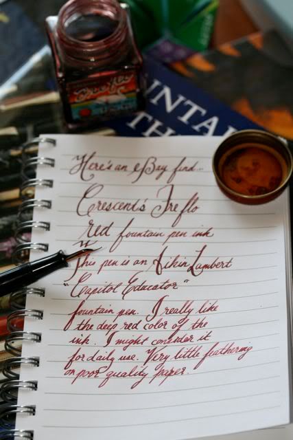
The color is a deep scarlet red, also known as carmine. I've compared the color to venous blood, or the red pepper and garlic sauce you find at Chinese restaurants. The ink writes in a dull pink, but darkens slightly as it dries. It is resistant to bleeding through the paper, but dries relatively quickly. I doubt that it contains iron gall material. As opposed to modern inks, I suspect this red is based on a natural cochineal dye. Cochineal is a sessile parasite of a desert cactus. Its body contains carminic acid, which is boiled out, and mixed with aluminum or calcium salts to produce a deep red dye that is commonly used in the food and fabric industry. The color has an attractive professional appearance that I have used for daily writing. It is an instantly recognizable color, especially if you were born before 1970.
Initially, I was not a fan of red ink, but Crescent’s Freflo ink has won me over. It has a deep rich carmine red that flows well and doesn’t clog in the pen. For old-timers, its color is easily recognizable, but rarely seen from modern inks and dyes. Freflo’s shading provides a nice contrast that is pleasing to look at. There is little feathering, and virtually no bleeding through the paper. I have used this as a daily ink. It stands out instantly on the paper, but doesn’t attract too much attention to itself. When purchasing vintage inks, do not use any writing fluid that contains mold or un-dissolved sediment.

A few comments on the color sample figure.All of these samples were made from my red inks in my collection. I used a cotton swab and performed a swatch of color, followed by a second application to the first half, allowing it to shade. The paper was photographed in the afternoon sun. What I first noticed was that Pelikan Brilliant Red (this sample was from the 1930s) was almost identical to Reform's red (a new old stock). I suspect that they were made to the same formula by the same company. Noodler's Dragon's Napalm is a good copy of the Pelikan ink. I'll probably never use Levenger's Pinkly: it's just too pink. Yard-O-Led inks are made by Diamine. Crescent's Freflo Red is at the bottom. This color appears to be very similar to Diamine's Monaco Red. However, I do not have this ink available at present for comparison.
It's a beautiful colour and the designs on the old labels are wonderful too. I really like the shading from your writing sample. It reminds me a bit of J. Herbin 1670 from the photos. Thanks for sharing!
ReplyDeleteGentian: Yes, it does remind me of J. Herbin's 1670. However, I found it in some ways superior to that ink, mainly in its washability, the flow, and the way it looks on paper. J. Herbin tends to be a bit more saturated. Of course, this ink has been sitting in the bottle for 60 years.
ReplyDelete