Friday, November 25, 2011

Another pumpkin soup recipe


We bought a pumpkin for Halloween that was left un-carved. Instead of throwing it out, I decided to carve the carcass into food. Here’s my version. 

5 cups water
1 ½ tablespoons vegetarian soup base (Better Than Bouillon™)
½ large pumpkin (approx. 20 pound pumpkin)
3 cloves garlic
1 white onion
½ cup heavy whipping cream
½ teaspoon chopped fresh thyme
½ tablespoon crushed red pepper flakes
4 tablespoons chopped fresh parsley (garnish)

Directions

1.    Cut the pumpkin into large sections and place face down onto a baking sheet. Place into an oven at 350º F for one hour.
2.    Sautee the onions and garlic in olive oil until brown. Add spices.
3.    Slice the skin off the pumpkin sections and place into a food processor with some water, and puree with the onions, garlic and spices.
4.    Place contents into pot, and simmer contents in open container for 30 minutes. Add cream.
5.    Garnish with parsley.

Friday, September 30, 2011

My grandfather


Here is a photograph (circa 1955) of my grandfather I found on the internet. He is, by the way, holding a baton. Several years ago, I had found another photograph on the internet of him and my grandmother as young newlyweds outside of Chicago around 1925. There were several other Guderyahn's in the picture. They had children, and grandchildren and great-grandchildren. One of those people, distant from me, posted that photograph of the young couple with my grandmother in a summer flapper dress. She was a rather cute woman. That's funny, I can never imagine my grandmother as "cute." But there she was, standing in front of my grandfather, outside of a lake cabin somewhere near Chicago. A couple of years later, he got a job teaching at a small Lutheran College in South Dakota. From there he started a music program that created a local symphony.

My grandparents, second couple from left, along with the entire Guderyahn family, Chicago, circa 1925.


     I never met the man. He died a few years before I was born, collapsing at the podium. He had developed congestive heart failure related to rheumatic heart disease, a common disease of the time. Had he lived a few more years, he may have received an artificial valve, which hadn't been invented at the time. He was a violist. As a kid, I grew rather tired of hearing from people what a wonderful man he was. I never knew the man. I didn't know his personality, or what made him great. Most of the people that knew him have since passed, and I rarely hear about him any more. Nonetheless, here is a man from humble beginnings in Chicago, who moved to a small town in South Dakota, and started a music program that has since grown and matured and created several professional musicians who have gone off to have wonderful careers. It all started with this man. As I grow older, I see life as more of a continuum and less of how it starts and ends with me. My children have followed in my footsteps, forgetting about my aging parents as they have lives of their own. Maybe some day I will have grandchildren. I hope they will know me.

Sunday, September 11, 2011

More photographs from San Diego

In the event that you missed some of these photo-posts on Twitter, I'll show them again here. It's been a warm week in San Diego. On Thursday evening, the entire county lost power, affecting some 3 million people. I suspect that people on the East Coast didn't care, what with their silly rainstorm and all. And for the most part, it was no big deal. It gave us chance to appreciate life without television and computers, and get out and meet the neighbors. For some reason, all I could think about is drinking a cold beer. I mean, if you're gonna have a Blackout on a hot day, you gotta have a beer. Turns out, a lot of people I talked to thought the exact same thing. I was thinking, we should have one of these blackouts next week.

September 9, 2011 headline in the Union Tribune after the largest power outage in San Diego history.

Sunset looking West from our house. It was especially humid that evening this past week making the sky especially orange at sunset.

Another close-up photograph taken by my 13-year-old daughter of the tomato plant.

My 13-year-old daughter turned the camera onto her face.

Moonrise on Mt. Woodson, San Diego. This is looking east at sunset, August 11. It's a waxing moon: tomorrow is full.

Super close-up photo of Torey the cat. Serious cat is serious.

Monday, September 5, 2011

My daughter's backyard camera adventure

My 13 year-old daughter grabbed the camera and ran around the backyard taking very close-up pictures with the macro lens attachment. It rained today, now a very common Summer event in San Diego. Here is the result of today's work:


Saturday, August 6, 2011

Atrial flutter in the human heart

The cardiologist view of the human heart is often reported as a structural entity with valves that pumps blood around. It has these arteries that run along the outside of the heart that when they get plugged up, can cause a heart attack, or lead to a catheter intervention or bypass surgery. Essentially it is a pump with fuel lines. I see it in a slightly different way, looking at it also from its electrical standpoint. This is often under-appreciated by the medical community, as cardiac electrophysiologists are looked at as the nerds and geeks of the cardiac world. For years, no one, except for the electrophysiologists themselves, really understood what the hell they did. Many of the pioneers of the EP world were locked up in academic centers for 12 to 24 hours at time studying a single patient without much to offer as a cure. That changed in the late 1980s and early 1990s as ablation of cardiac arrhythmic pathways became the new treatment paradigm. In other words, the nerds actually did something that could make money. Here's a case I worked on today. Three or four years ago, I could create something like this in a matter of a couple of hours (see figure below). Today, this electroanatomical map of a cardiac arrhythmia was created in a matter of minutes. Pretty amazing.


Here is a model of the heart showing atrial flutter in the right atrium of the heart. In our patient today, the rhythm actually rotated in an opposite (or clockwise) direction.


Atrial flutter map in a clockwise direction shown in the right atrium of the human heart. In this view, we are looking down on heart. The entire heart is not shown, only the right atrium (seen as H in the figure below). The round structure is the superior vena cava (seen as G in the figure below).


Here's how it works. This is the CARTO system that is sold by a company called Biosense-Webster. There is another company called ESI-Navx that produces a similar product. Patches are placed on the outside of the body: this is essentially a GPS system, where the heart is the planet, and the platinum-tipped catheter is the body on (in) the planet. The catheters have a magnetic location tip. The catheter is a very long wire inserted through the femoral vein inside the right (and left) groins, and run up the vein into the heart, much like a very long intravenous line. However, this line is connected to a recording and pacing device that is also run through the CARTO system.

When the catheter tip touches the inside wall of the heart, the impedance changes, and the computer is told to make a point. As the catheter is drawn across the inside of the heart, the point becomes a line, which becomes a plane, which becomes a shell, which becomes a chamber of the heart.

In this case the catheter(s) were contained within the right atrium. The patient arrived to the lab with an underlying cardiac arrhythmia called atrial flutter. We were pretty sure it was well-contained within the right atrium, but we wanted to make certain. The total time of the procedure to terminate the arrhythmia took approximately 15 minutes, but we liked playing around with the arrhythmia just to make sure we ablated in the right spot.


Here is another view from our case today. This is an anterior view with the superior vena cava being that structure on top. This is just the right atrium. The arrhythmia is moving from the anterior-lateral part of the heart across the top in a clockwise manner and down along the posterior-medial part of the heart across the cavo-tricuspid isthmus (CTI in figure above). Ablation from the CTI to the inferior vena cava terminated the arrhythmia.


Atrial flutter is the electrical energy of the heart that is caught in a closed loop, much like when your computer does the spinning hourglass (Windows) or spinning pinwheel (Mac). This is a re-entrant arrhythmia, meaning that it goes round and round inside of the heart. In the 1970s, scientists didn't have clue on how this worked, until somebody one day opened up a dog or a pig or a human and actually measured the timing cycles of this electrical energy moving around and around in a circle. Fortunately with computers, this can be easily demonstrated. This patient was in the arrhythmia for nearly a year. The top figure is that of the right atrium looking down from the superior vena cava. The colors are assigned to time, so that red is early and purple is late. As you look down on the heart you can see the energy spinning in a clockwise fashion. Think of it has a millions of cells performing the 'wave' inside the right atrium. 

Fortunately this arrhythmia has to travel across a bridge. This bridge is the cavo-tricuspid isthmus. Get rid of the bridge, and you break the circuit. You don't have to cut the heart open, just apply radiofrequency energy (or heat) to this ridge to lightly scar this tiny area. Ablation is accomplished by drawing a line of RF energy from the cavo-tricuspid isthmus (CTI in figure below) to the inferior vena cava. Magically the cardiac rhythm was restored, and the patient went home without complication.


Sunday, July 10, 2011

My week in pictures (July 1-9, 2011)

Do you know this bird? This bird had been skulking around our back yard looking for bugs in the grass.

This is the coolest face I could muster while holding a cheesepuff.


Friday morning eggs & toast. My wife is the master of food layout. While I tend to throw everything onto the plate like it has been freshly vomited, my wife tends to make everything edible very pretty. I was so amazed by it, I took a picture.


Fireworks. My nephew was taking hundreds of pictures using my brother's new camera. A few of them turned out pretty amazing. Here is one.

Sunday, June 12, 2011

Charles H. Ingersoll 'Dollar' Pen (1924-1931)

Ingersoll 'Dollar' Pen with ribbed pattern.

Introduction:
Charles H. Ingersoll, along with his brother, Robert, founded the Robert H. Ingersoll & Brother Company in 1892, makers of the Ingersoll watch. Their pocket watches, the ‘Jumbo,’ ‘Yankee,’ and the ‘Reliance,’ were the Timex of its day. These dollar watches were quite popular, selling over 70 million by the end of World War I. Despite their success, the company was unable to pay its creditors, declaring bankruptcy in 1921. The company was reorganized and Waterbury clock continued to make watches using the company’s name. The company eventually became Waterbury-Ingersoll, later U.S. Time, later Timex. New York Times article on Ingersoll watches.


In 1924, Charles Ingersoll formed the Charles Ingersoll Dollar Pen Company in Newark, later moving to East Orange, New Jersey. They weren’t the only company in history to produce a “dollar” pen (e.g. Evans or Esterbrook). But clearly, Ingersoll was trying to capitalize on the Dollar Watch fame. The company existed until about 1931, producing a nickel-plated brass pen with a 14 karat gold nib and iridium tip. These pens sold for $1.00. That’s $12.50 in today’s economy.


Fourteen karat gold nib with "CHI" stamp.
Later the company added a junior/ladies pen selling for $1.50 and a oversized Bakelite or celluloid pen for $2.00. These pens featured a two-point bearing clip and a unique twist-filling mechanism using an oversized watch-like stem-winder. Ingersoll marketed their pens to compete against the low-end nameless pens with steel nibs. Ingersoll offered high quality 14-karat gold nibs with iridium tipping, much like the “$50” Waterman’s or Parker’s of the day. The nib is easily recognized by the initials "CHI" for Charles Henry Ingersoll. Ingersoll saved on manufacturing and material costs, using brass tubing stock for the body and cap, cheaper, and more readily in supply. It was also easier to form. They avoided cutting a slot into the side of the pen for the lever. Instead a large upholstery tack was used as the filler. It was a simple filling mechanism, but one that also drew up a large amount of ink. Dimensions: Length: 12.8 cm (5”) closed (the twist filler adds an additional 1/8” inch to the length); Cap 5.9 cm (2-5/16”). Width 1 cm (7/16”).

How the ink-filling mechanism works:  Ingersoll used a stem-winder twist-filler system at the back end of the pen. This stem-winder looks very much like an upholstery tack. This tack is inserted through a small hole in the back end of the pen, and into a hard rubber or wooden plug inside the pen. The plug serves as a mount for the back end of a rubber sac, which is cut to fit over the plug.
Twist-filling mechanism.
The other end of the sac is then fitted over the feed. It’s not a complicated system, although it really confused me at first. Twisting the stem-winder about a half-turn squeezes out the rubber sac, much like a sponge. When the stem-winder is released the sac springs open. With the nib sitting inside an ink-well, the action of releasing the stem-winder draws ink through the nib assembly and into the sac. I have seen the twist-filling mechanism on some Gold Bond's, Esterbrooks, Wahl's and Mabie-Todd's.

Writing sample. Click to enlarge.

How does it write: The characteristic of the nib on paper is based not only on the design and material of the nib, but also the paper, the ink, the restoration of the nib, and just blind luck. I have two pens, and can confidently comment on both. The gold nib has a bit of tooth. I’ve tried to adjust and smooth it. I’ve also tried different inks. Despite that, I cannot seem to get it to the butter-on-Teflon smoothness that I prefer in all pens. The tooth doesn’t affect the writing performance, and is not irritating. The nib is firm enough to cut through carbon paper, but there is definitely a bit of flex. 

This is a pen that I’m comfortable letting others try. But it’s not the spokesmodel for the wonderment of writing with fountain pens. Some people will not post pens. I will when it balances the writing instrument, and this pen would be better balanced when it is posted.
Fleur-de-lis pattern on an Ingersoll pen.

It certainly writes well, but it’s not an all-day writer. It got a bit heavy by the end of a page of writing. When I switched to a plastic Parker, my hand breathed a sigh of relief. I would probably prefer a wider pen. Ingersoll did produce plastic pens in larger sizes.
Finding your own pen:  A nickel-plated brass pen would appear indestructible. However, the sections are prone to cracking. One of my two pens has a large crack in it, but it doesn't affect the writing performance (one restoration specialist has been known to fill this crack with epoxy). These sections are form-fit onto the brass body, and often require a bit of muscle to remove. I was able to successfully remove the section for restoration purposes without fracturing it. The nickel plating on the body is also prone to brassing and wear. This pen has a bit of plating wear along the body, just beneath the cap. A completely clean model is difficult, but not impossible, to find. The pen originally sold for $1. However, modern prices for these pens, depending upon condition, vary from $10 to $90.
Crack commonly found in section.

Conclusion:  I’m a sucker for unique designs and unusual filling-mechanisms. The Ingersoll pen offers both. Its metal body stands out in a collection of pens. Meanwhile, the twist-filler is a unique, and actually quite efficient, mechanism for filling the pen with ink. These pens were not produced as status symbols for executives, and it’s overall finish and design reflects that. However, they are durable writing instruments, that fall well below the radar among collectors.


Tuesday, June 7, 2011

The Daily Arsenal of Writing Instruments For This Week


Here is an example my penchant for taking a very innocuous subject and producing a marathon of information.

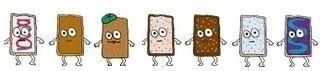
The #dailyarsenal or daily arsenal of writing instruments was a hash tag on Twitter started by, I think, @DIYSara. It caught on quickly, as various folks will still post pictures of the pens, inks and papers that they are using that very day. Usually, on my blog, I try to post some relevant and useful information, if only to a very small audience. This one breaks that tradition. This post is completely useless except to reveal my odd relationship with writing instruments.

As an extension of some mild form of compulsive disorder, I have always had a fascination with writing instruments. When I was in school, I had The Lucky Pencil: This was the pencil that I took with me during tests. The Lucky Pencil evolved into a mechanical pencil, which went with me everywhere. I think it was a Parker mechanical pencil, steel top over a blue section. One does not lose The Lucky Pencil, because that would be very unlucky. Eventually after several years of use, The Lucky Pencil broke, or was lost, or whatever. Maybe it’s around here somewhere in the house. Maybe its stored in some aluminum air-tight special container.

The Lucky Pencil eventually evolved into The Lucky Pen. The original pen was a Retro 51 Tornado roller-ball. It was aluminum pen with a copper anodized finish. I must have gone through $3 or $4 weekly in roller-ball refills for this  pen. I used to find gel-ink refills from cheap plastic pens, and modify them for use inside the Retro 51. That pen was with me for nearly 6 or 7 years, until I eventually lost it. It was so beat up after years of use, that I was more bothered by the idea of losing the pen than actually losing it. I tried to replace the pen, but it wasn’t the same. 

I purchased a fountain pen because I grew tired of buying gel-ink refills. I thought, if I can purchase just one fountain pen and one bottle of ink, I would be set for life. My first ‘real’ pen was a Pelikan M215, probably the best purchase I ever made. However, I rarely use it any more. I have bought and sold more pens over the last 4 years than I could ever imagine.

Why do I write with a fountain pen? I enjoy the application of a nice even line of ink with barely touching the nib to the paper. It’s not as easy as it sounds. Once you apply the point to the paper, it’s best to not lift it off.  I forced myself to retrain my hand. It took several weeks to figure it out, but now I don’t want to ever go back.  I can’t stand writing with ballpoint pens, unless I’m writing on thermal paper. But I’ll save that for another blog post.

So, after handling hundreds of pens, I have honed down my choices to one or two pens out of perhaps ten that I carry as part of my regular starting rotation of writing instruments. Some of my favorite writers are Parker 61s, Parker 51s, Parker 21s, a flattop Sheaffer, the TWSBI pen, the Eversharp Skyline, Waterman Emblem (100-Year) and a Moore 94-A.  Once I have locked pen and ink into regular rotation, I rarely let it go.

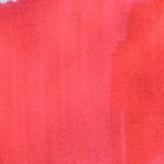
I have a medium-point Parker ’61’ (shown here) with stainless steel cap 
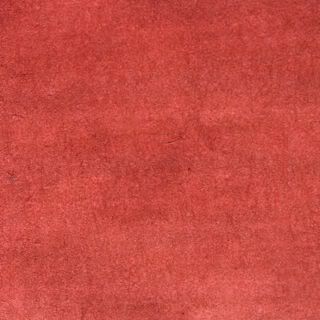
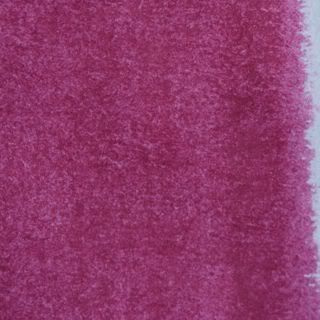
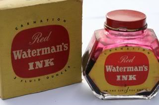
and red body (circa 1958). I mixed up a concoction of my version of rose-colored ink (copying the Skrip Persian Rose color of the 1950s) using Rohrer & Klingner Solferino and Fermanbuk (purple and red).  The red ink went well with the red pen. I love this pen because it doesn’t skip. It doesn’t blort out ink. The ink always stays true to the feed. Plus, you can carry it on planes without the pen leaking.

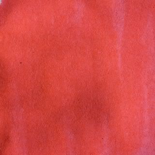
My other go-to pen is a Parker ‘51’ demi-sized (shown here) that someone gave to me (circa 1947). It has a razor sharp extra-fine point, but always writes smoothly. I initially loaded Private Reserve’s Tanzanite (violet blue), and have practically gone through half-a-bottle before I decided to clean out the pen. I have since switched to Noodler’s Dark Matter temporarily. The ‘51’ handles this ink well. But I miss writing with Tanzanite, and plan to switch back.

With a couple of regular starters, I’ll mix in one of my guest-pens off the bench. These are pens that I may have purchased recently or in the past that have not gone into regular rotation. Maybe they have an odd filling system, or like the Eversharp Skyline, require frequent refilling. Maybe the flow from the feed is a bit odd. Perhaps it has a flexible nib. Flexible nibs are more of a novelty. They are designed to be used without bending the nib. But you can’t help adding a little shading or flourish to your capital letters. 

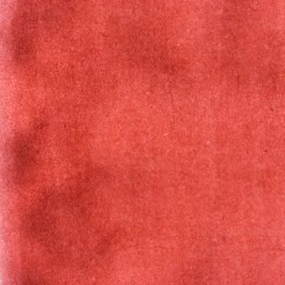
I have acquired a couple of old Charles H. Ingersoll ‘Dollar’ pens. My latest one has an uncommon fleur-de-lis pattern stamped into the pen (shown here). In 1924, Charles Ingersoll of the "Dollar Watch" fame, formed the Charles Ingersoll Dollar Pen Company in Newark, later moving to East Orange, New Jersey. Ingersoll's company wasn’t the only company in history to produce a “dollar” pen (e.g. Evans or Esterbrook). But clearly, Ingersoll was trying to capitalize on the Dollar Watch fame. The company existed until about 1931, producing a nickel-plated brass pen with a 14 karat gold nib and iridium tip. These pens sold for $1.00. That’s $12.50 in today’s economy. The company marketed their pens to compete against the low-end nameless pens with steel nibs. Ingersoll offered high quality 14-karat gold nibs with iridium tipping, much like the “$50” Waterman’s or Parker’s of the day. Ingersoll however saved on manufacturing and material costs. Ingersoll used brass tubing stock for the body and cap, cheaper, and more readily in supply. It was also easier to form. They avoided cutting a slot into the side of the pen for the lever. Instead a large upholstery tack was used as the filler. It was a simple filling mechanism, but one that also drew up a large amount of ink.

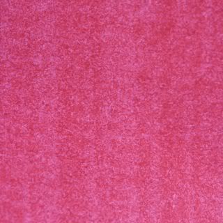
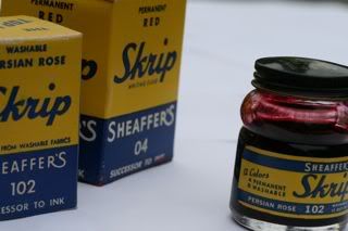
The ink used in the Ingersoll pen is another weird mixture, but also a bit of an accident. I was trying to mix up another batch of my faux Skrip Persian Rose, and used Rohrer & Klingner Scabiosa instead of Solferino. The result is a dusky rose-red. It’s a pleasing red that’s easy on the eyes.  However, the weight of the brass pen quiets any enthusiasm for extended writing. Once this pen has dried its ink, it will go back into the box and I’ll add another guest-pen into rotation.

Saturday, May 28, 2011

A Collection of Vintage Red Inks

Here is a small collection of vintage red inks from about 1938 to 1963. Red ink is just red ink. But each company's interpretation of the color red is slightly different. All of these inks are 'writing fluid' (that's an old Sheaffer designation) for fountain pens. They have all been used in fountain pens, and work amazingly well.


Carter's Hunting Red

Carter's Ink (Boston, Mass.) changed their cubed bottle design to the 'new oval' in the early 1940s, giving their product line a new facelift. The ink looks and performs very similarly to their Permanent Red and Sunset Red from the early to late 1930s. Some have considered this color red similar to venous hemoglobin (human blood). There are definitely some brown undertones. I think it's more brick-red.


Crescent Fre-Flo Red


A carmine red produced by Crescent Products Co. (Terre Haute, Ind.). See review here.


 Sanford Pen-It Cardinal Red


Sanford (Chicago, Ill.) began producing their Pen-It ink in cute little jars, probably around 1937, up until the mid 1950s. These 1-ounce bottles were initially presented in commemorative catalin (plastic) globes for the 1938 New York World's Fair. The ink is very similar to Pelikan Brilliant Red (or Noodler's Dragon's Napalm, modern), with pinkish-orange undertones.


Pelikan Brilliant Red


Wilhelm Wagenfeld created one of the classic ink-bottle designs in 1938 for Günther Wagner Company, makers of Pelikan pens and inks. This bottle was produced by Vereinigte-Lausitzer-Glaswerke VLG Weisswasser. Pelikan red ink still produced today. It is a translucent red analine dye with orange and pinkish undertones, very similar to Sanford's red ink seen above.


Carter's Sunset Red

Carter's cube shaped bottles of the 1930s are a favorite among collectors. Initially, Carter's released the 'Sunset' series of inks, with all of their brightly colored inks, even green, labeled with the 'Sunset' moniker. I presume that while there may had been many changes to their formulation, the red color has remained consistent, no matter how many different ways it has been renamed and repackaged.


Waterman's Carnation Red


Although Louis Waterman’s company is noted for the capillary feed and the cartridge-filling mechanism (thanks to its French subsidiary JIF-Waterman), one of its most well-recognized company designs comes from someone outside of Waterman; that is, the Waterman ink bottle.  Ted Piazzoli was an employee of Capstan Glass of Connelsville, Pennsylvania. As such, he designed several patented jars and bottles that he signed over the rights to the Capstan company, all but the one Waterman ink bottle.  He was granted the rights to this patent in March 1936. Capstan produced the first jars for Waterman. In 1938, Capstan was reorganized as Anchor Hocking. In the early 1950s, Waterman released its larger 3-ounce ink bottle. Carnation red has a nice rose-pink shading, similar in look to Sheaffer's Skrip Persian Rose. 

Sheaffer Skrip Red


Sheaffer Skrip Persian Rose


Here are two classic Sheaffer inks from the 1950s. Since the 1940s, Sheaffer began producing a glass bottle with a small well at the top for users to dip their fountain pen nib without dipping it straight into the mother lode.  Skrip Red is considered by many to be a "true red," whatever that means. I think it's shade represents the color of a stop sign. Perhaps you're not seeing stop-sign red in my photographic sample. However, when you brush the ink onto the page, it becomes very clear. Skrip's Persian Rose is what I call the mythical ink for two reasons: one, it's a color that has been copied by several ink producers over the past 70 years; two, because of instability of the dye, no two Persian Rose inks remain exactly the same. Some have a nice deep rose color like you see here, others have turned to an avocado green. You can still purchase Skrip Red ink new. But Persian Rose is a rare find, with bottle prices ranging from $25 to $85 for a 2-ounce bottle.


Parker Quink Red


I love these diamond-shaped bottles from the late 1950s-early 1960s. Parker's Quink ink was originally formulated in the 1930s. Quink red has a very pleasant cherry-red color that calls attention to itself when using it for marking up black typed copy. It's a bit bright as a regular writer on a filled page.